Advanced Typography - Final Compilation & Reflection
05/04/2023 - 05/07/2023 (Week 1 - Week 14)
Jason Antony 0356335
Bachelor of Design (Hons) in Creative Media (UX/UI)
Advanced Typography
Final Compilation & Reflection
INSTRUCTIONS
SUBMISSIONS
Task 1 / Exercise 1 - Typographic Systems
(05/04/2023 - 03/05/2023 / Week 1 - Week 5)

Fig. 1.0 Final Axial System - JPEG (12/04/2023)

Fig. 1.2 Final Radial System - JPEG (12/04/2023)

Fig. 1.3 Final Dilatational System - JPEG (12/04/2023)

Fig. 1.4 Final Random System - JPEG (12/04/2023)

Fig. 1.5 Final Grid System - JPEG (12/04/2023)

Fig. 1.6 Final Modular System - JPEG (12/04/2023)
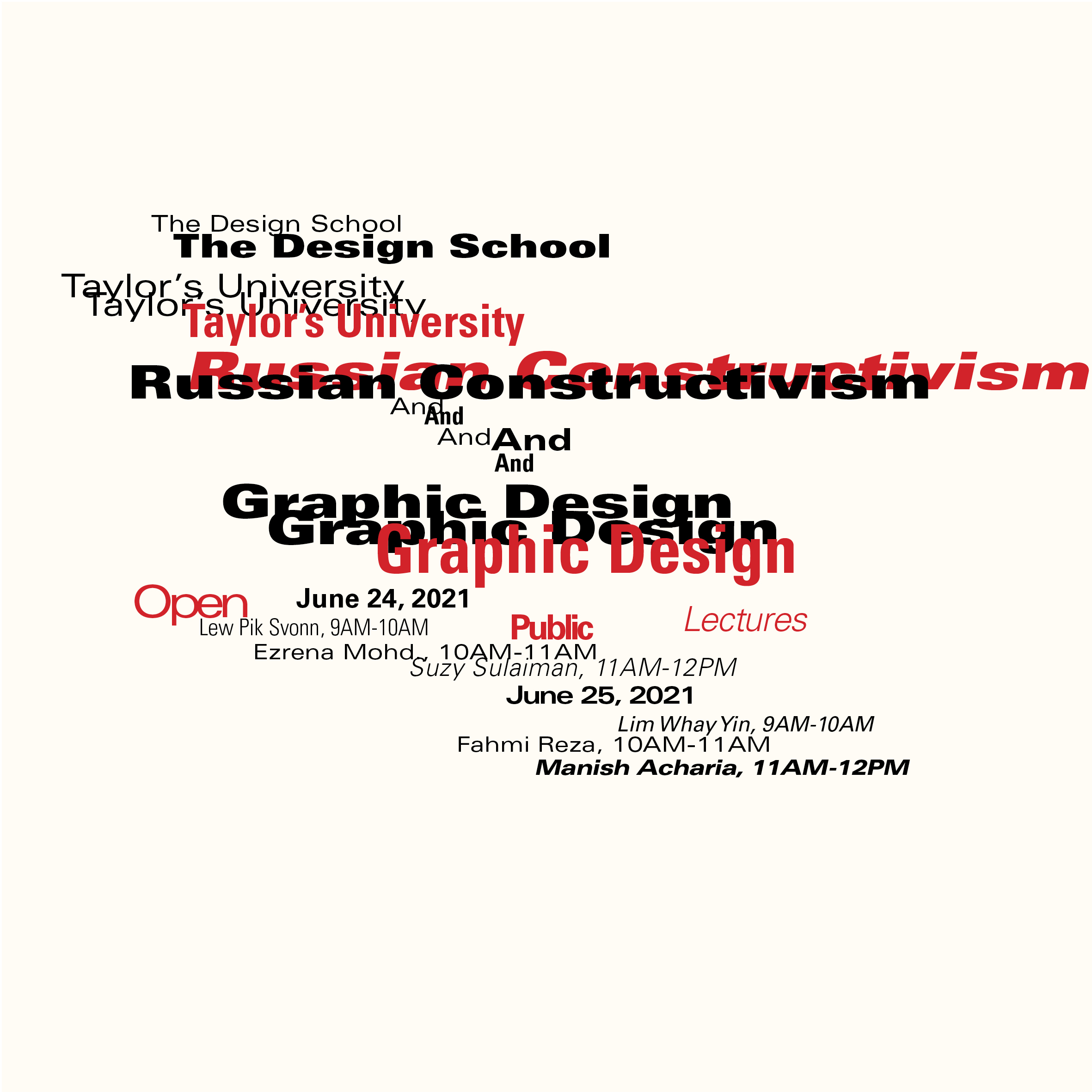
Fig. 1.7 Final Transitional System - JPEG (12/04/2023)

Fig. 1.8 Final Bilateral System - JPEG (12/04/2023)
Fig. 1.9 Final Task 1: Exercise 1 / Typographic Systems - PDF (12/04/2023)
Task 1 / Exercise 2 - Type & Play
(05/04/2023 - 03/05/2023 / Week 1 - Week 5)


Fig. 1.16 Final Movie Poster JPEG (05/05/2023)
Fig. 1.17 Finalised Finding Type - PDF (26/04/2023)
Task 2A / Key Artwork
(03/05/2023 - 31/05/2023 / Week 5 - Week 8)


Task 2B / Collateral
(03/05/2023 - 31/05/2023 / Week 1 - Week 5)
Instagram Username: @jjjjvson
Instagram link https://instagram.com/jjjjvson?igshid=OGQ5ZDc2ODk2ZA==

Task 3 / Type Exploration & Application
(31/05/2023 - 05/07/2023 / Week 9 - Week 14)
.ttf link
https://drive.google.com/drive/folders/1pD0RQljFEiRGjl1n8A5oFYBc4DgoQh3a?usp=sharing
Type Specimen
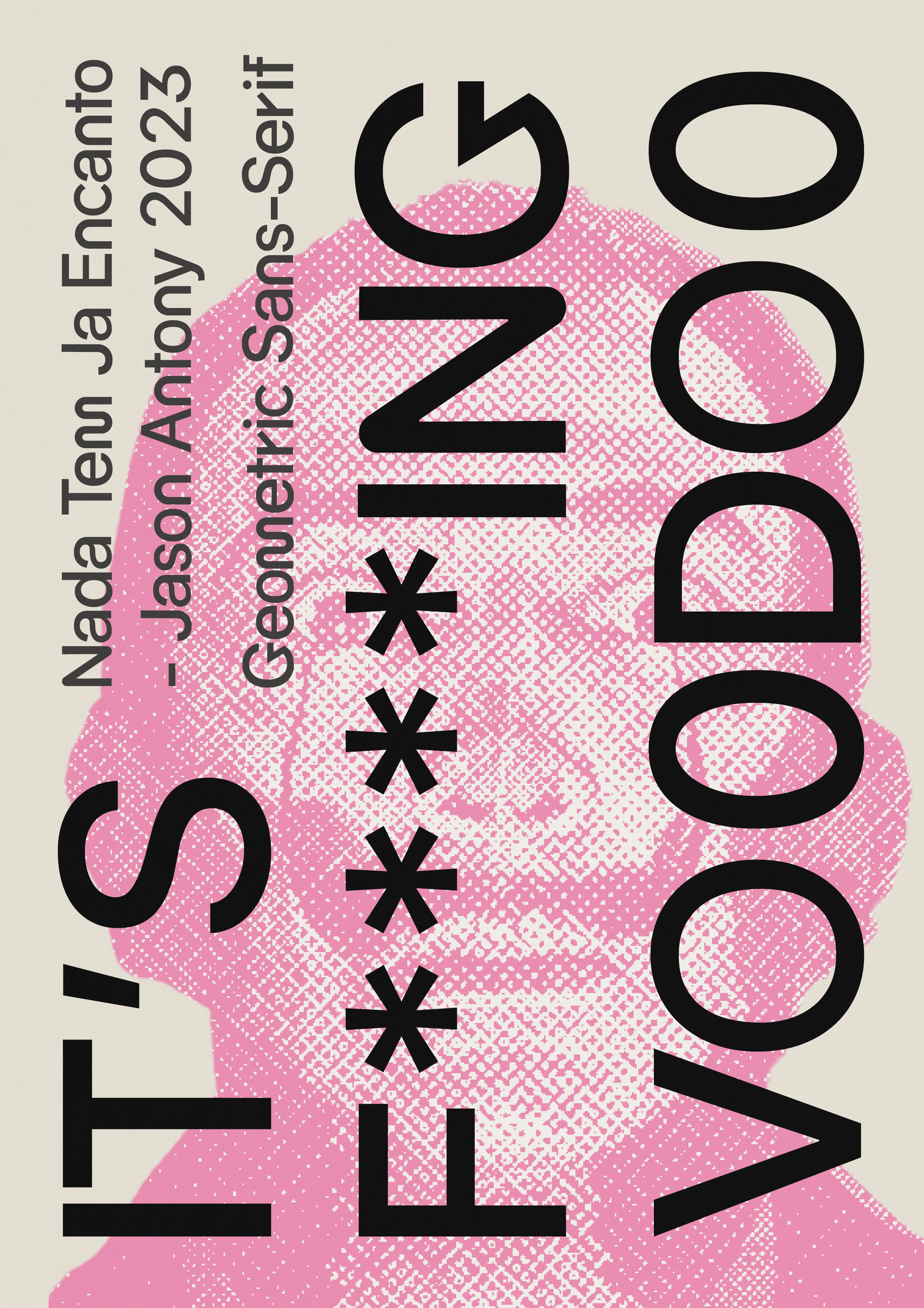
Fig.3.0 Final Type Specimen pg1 JPEG (06/07/2023)


Applications


FINAL REFLECTIONS
Experience
I've started a fantastic path that has allowed me to learn more about the complex realm of visual communication as a design student who is deeply involved in the study of advanced typography. My perspective on the influence of typefaces and how they affect the overall message and tone of any design project has been greatly enriched by my work in this particular subject. I had the luxury of immersing myself in a diverse field that combines creativity, aesthetics, and technicality as a design student exploring the world of advanced typography. By exploring typography, I have been able to gain a deeper understanding of how typography affects my life and others who look at my designs.
Observations
I have discovered a number of fascinating things about advanced typography while studying. The first thing I've learned about typography is that it's much more than just choosing fonts; it's an art that demands great attention to detail. Each typeface has a unique personality, generating various feelings and expressing various ideas. I've seen firsthand how a small adjustment to the font's style or size can radically transform how people react to a design. Additionally, I've seen the importance of hierarchy in typography. The placement of headlines, subheadings, and body text is extremely important for directing the viewer's attention and creating a hierarchy in the visual representation. The strategic use of font weights, styles, and variations helps create a sense of order and emphasizes the most critical elements within a design. I have also developed a weird vision ever since I studied typography with Mr.Vinod. I cannot look at fonts the same way anymore, and I will always subconsciously criticize a bad font, bad font usage, bad kerning, bad hierarchy, etc.
Findings
I have discovered a number of significant things that have expanded my knowledge of this field. First of all, I've learned how crucial it is to take legibility and readability into account while designing type. I've discovered by experimenting with various typefaces that intelligibility should never be sacrificed for looks. It is essential to use typefaces that are simple to read, especially when designing for several media like print or the internet. I also realized that developing a typeface requires so much work and thought. Just the kerning process alone could take up to months. I have learned so much about typography, and I will never forget the lessons that Mr.Vinod has taught me along the way.
There is nothing left to say except thank you. Even though you were a harsh teacher at times, your guidance and hope have made me forever grateful for the lessons you taught.

Comments
Post a Comment