Advanced Typography Task 2 Key Artwork and Collateral
03/05/2023 - 31/05/2023 Week 5 - Week 9
Jason Antony / 0356335
Advanced Typography / Bachelor of Design (Hons) in Creative Media
Task 2 Key Artwork and Collateral
Instructions
Task 2A: Key Artwork
For Task 2A, we are tasked to design a key artwork, it plays a key role and
functions like the artwork but is a logo/mark that consists of letters. Used
to identify a person, we are then required to slab it onto a lapel
pin/T-shirt/poster (collateral). It becomes a visual identifier when the
mark is expanded.
There are technical obstacles whereby we need to use Photoshop to
manipulate, challenging our observation skills, how much we can understand
the image and forms, and utilizing our creativity.
Ideation & Sketches
Sketch Week 5
Key artwork ideas based on my style and identity, along with the following
below:
- Keywords: Modern, Classy, Cool

Fig.1.0 sketches 03/05/23
This first set of sketches had the keywords modern classy and cool as a
design guide. My favorite among these was the first monogram.
After choosing which sketch I wanted to refine, I experimented with
different arrangements. I also added another design that was inspired by
blackletter logos.

Fig.1.1 First Digitized Designs 10/05/23

Fig.1.2 Trying Brush Strokes in Illustrator 10/05/23

Fig.1.3 First Design Refinement 10/05/23
Week 7
I wasn't too happy with the design I refined in the previous week. I used
Procreate to finalize the letterforms using a blackletter calligraphic
tool. I also wanted to refine the 2nd design, which was the monogram.
References

Fig,1.4 https://pin.it/5XAlbq4

Fig.1.5 https://pin.it/55T6eZm
These blackletter designs are fascinating to me and I really feel that
it relates to myself and the brand I'm trying to create. However, they
are not legible at all, so I want to solve this problem as well in my
Key Artwork.

Fig.1.6 Procreate Letterform Sketch 17/05/23

Fig.1.7 Procreate Letterform Sketch 17/05/23

Fig.1.8 Procreate Letterform Sketch with Tool 17/05/23

Fig.1.9 Procreate Monogram Sketch 17/05/23

Fig.1.10 Digitized Designs 17/05/23

Fig.1.11 Digitized Designs 17/05/23
Final Key Artwork

Fig.2.1 Final Artwork JPG 18/05/23

Fig.2.2 Final Artwork Black JPG 18/05/23
Fig.2.3 Final Artwork PDF 18/05/23
Task 2B: Collateral
For Task 2B, we are tasked to design collaterals such as a t-shirt, lapel
pin, and animated key artwork, and to create an Instagram account
transforming the key artwork into a brand. Firstly, we need to create an
Instagram account dedicated to our brand.
The work needs to be presented as 1024x1024 px @300ppi., if the file is
too big (>3MB) save the file @150ppi. Assets created are to be used and
presented creatively in our IG. Finally, we need to screengrab our IG
with our assets creatively presented.
Week 7 In class
Color Scheme

Fig.3.1 Color Scheme 17/05/23
Photograph

Fig.3.2 Photograph 17/05/23
Trial combining photograph and key artwork

Fig.3.3 Trial 1 17/05/23

Fig.3.4 Trial 2 17/05/23

Fig.3.5 Trial 3 17/05/23
Week 8
Mr. Vinod suggested that we go all out on our creativity. The weirder the better. So I embraced it.

Fig.4.1 Portrait 1 24/05/23

Fig.4.2 Portrait 2 24/05/23

Fig.5.1 Photoshop Workspace 24/05/23
I used the threshold filter in Photoshop to achieve the effect I wanted. Threshold refers to a specific image adjustment that converts a grayscale or color image into a high-contrast black and white. I then inverted the values of the black to white.

Fig.5.2 portrait design 24/05/23
Tshirt
I used Photoshop to place the graphic on a t-shirt. I used overlay as the blending mode and I used warp to conform my mark to the shape of the neck.

Fig.6.1 Back Design T-shirt 27/05/23

Fig.6.1 Front Design T-shirt 27/05/23
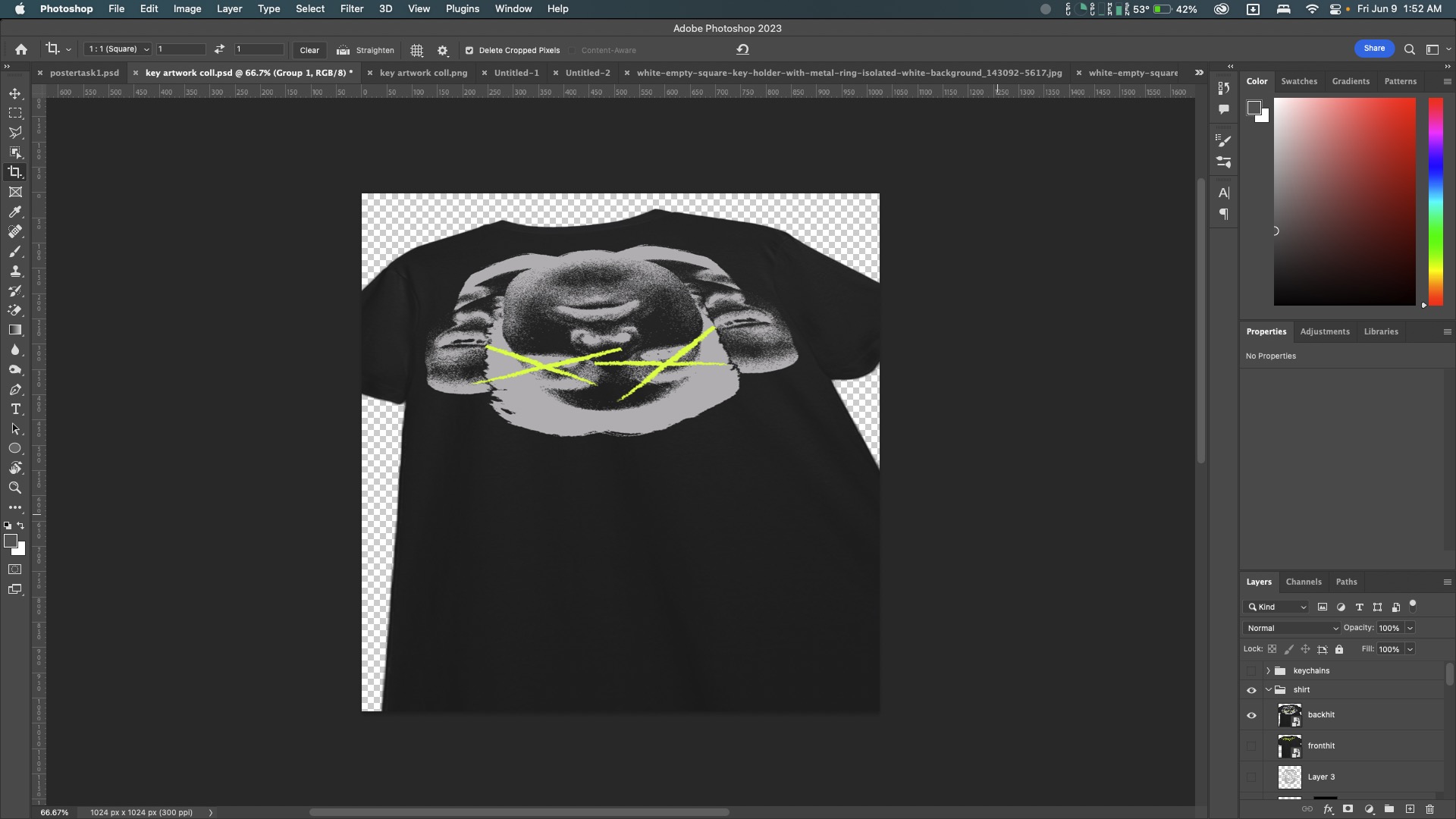
Fig.6.2 Photoshop workspace 27/05/23
Vinyl
I also used Photoshop to create the vinyl cover. I used the halftone effect and masking on the eyes.

Fig.7.1 Vinyl Cover 28/05/23

Fig.6.2 Photoshop workspace 28/05/23
I made the keychain using the 3d and materials effect in Illustrator. I have always loved physical things, and what better way to adapt my mark into a physical object than by making a keychain out of it.

Fig.7.1 Keychain 29/05/23

Fig.7.2 Illustrator workspace 29/05/23

Fig.7.3 Completed keychain 29/05/23
Animation
For the animation, I used Procreate to animate my mark. I wanted to create a subtle animation that is dynamic. 

Fig.8.1 Procreate workspace 30/05/23
Fig.8.2 Final Animation 30/05/23
Instagram Page

Fig.9.1 Main graphic 30/05/23
I used the letter J of my mark to create a monogram. I then proceeded to add noise to fit it in with my portrait style. This will be the main graphic of my Instagram page, which would be my main visual identity.
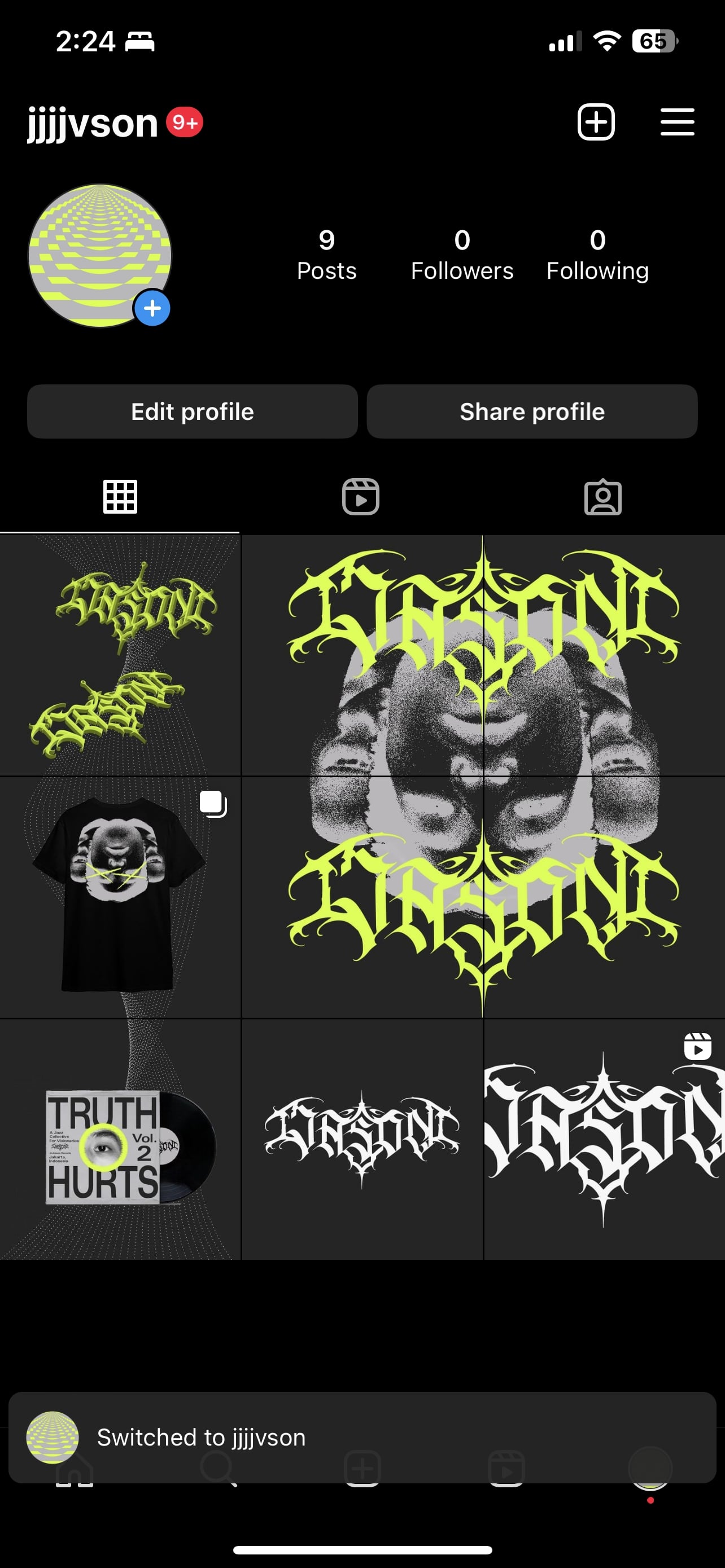
Fig.9.2 First attempt IG Page 30/05/23
Mr. Vinod said the page looks professional, yet tweaks in the showcasing of the collaterals have to be made. Also, the initial Instagram page was a bit repetitive in displaying the Mark.

Fig.9.2 Final IG Page 06//05/23
Final Task 2: Key Artwork & Collateral

Fig.10.1 Final Key Artwork 18/05/23

Fig.10.2 Final Instagram Page 06/06/23
Instagram link https://instagram.com/jjjjvson?igshid=OGQ5ZDc2ODk2ZA==


Feedback
Week 9
General feedback: don't be repetitive in showcasing your brand
Specific feedback: the page looks professional, yet tweaks in the showcasing of the collaterals have to be made. Also, the initial Instagram page was a bit repetitive in displaying the Mark.
Week 8
No Feedback ILW
Week 7
General Feedback: be as creative as possible in developing your brand.
Specific feedback: first design is fine. My photograph has to be fiercer. Be creative
Week 6
General Feedback: your design needs to have a strong relationship with your rationale.
Specific Feedback: 1st design is interesting, but has a long way to go. The frills and graphical elements need to have more weight and has to fit more with the type. The tool determines the form of the type. Make sure I use the right tool for both designs. Design 2 is more balanced but also needs a lot of work to refine.
Week 5
General Feedback:
1. Does the key artwork symbolically/creatively represent the person?
2. Is the key artwork readable and legible?
2. Does the key artwork look well crafted (lines/shapes)?
3. Does the key artwork look like a logo—is it free-standing (w/background)?
4. Is there a good balance between negative and positive space?
5. Is there unnecessary use of non-objective elements?
Specific Feedback: Be more mindful of negative space. Add 1 more letter for the Monogram.
Reflection
Experiences
This assignment allowed me to experiment with new ideas and improve my designs. From the early ideation and sketching stage to the final presentation, I participated in exercises that tested my observation, creativity, and technical ability. Although it was hard to come up with what I really wanted to do, this assignment made me think about how I wanted to represent myself to my brand. I grate full for this experience because it has taught me how to be more creative.
Observations
During the conception and sketching phases, I realized how important it was to link my key artwork concepts with my style and identity. Even though it was tough, these observations assisted me in understanding the importance of simplicity and clarity in effectively communicating my message and analyzing these insights. This assignment taught me to understand the value of constant improvement and refinement in the design process. It taught me how to condense my ideas, keep them simple, and effectively convey my message using visual elements and typography. I also learned the importance of assessing the essential artwork against specified criteria. I was able to enhance and improve the design by evaluating its symbolism, readability, craftsmanship, and the inclusion of extraneous parts, which cause repetitiveness. It taught me to look at my work critically and analyze how well it communicates with the intended audience.
Findings
Several major discoveries emerged during the feedback sessions and conversations, shaping the evolution of my designs. To begin, I realized that my first key artwork lacked character. Mr. Vinod and my colleagues' criticism emphasized the importance of refining and re-researching in order to get the desired look and feel. Looking back on my accomplishments, I am satisfied with the growth and development I have experienced during this task. Another noteworthy discovery was the significance of balance and composition in developing a visually appealing design. I learned to examine the negative and positive spaces and make sure they worked well together. Using appropriate calligraphic tools and carefully shaping the typography became crucial for conveying the desired message and maintaining the essence of my idea. Overall, I am proud and satisfied with the final design of my key artwork and key collateral, as they successfully represent my identity. However, I acknowledge that there is always room for improvement and further exploration. In conclusion, this assignment provided valuable opportunities to analyze and apply design principles. It gave me insights into the importance of observation, creativity, and technical skills in creating visually compelling and meaningful designs. I will continue to apply these lessons in future projects, striving for continuous growth as a designer.
Further Reading
Fig. 11.0 Typographic design: Form and communication (2015)
Reference:
Carter, R., Day, B., Meggs, P. B., Maxa, S., & Sanders, M.
(2015). Typographic design: Form and communication.
Hoboken, New Jersey: John Wiley & Sons, Inc.
Fig.11.1 Typographic processes and the computer, page 227
The process of typographic design has grown easier in the digital age. There are numerous methods for doing and developing the design, such as starting with sketches or designing directly in computer software. All approaches, however, are allowed as long as they result in an innovative and useful answer.
The ability to organize and store all design efforts is something I found really beneficial about working with a computer. Figure 11.1 demonstrates that Guilherme Villar's design compiles every iteration of each design on a single board. This allows him to easily compare and pick which of his designs should be shortlisted and finalized. This approach of archiving, I hope, will aid my design process in future works and projects.


Comments
Post a Comment