Advanced Typography - Task 3 / Type Exploration and Application
Advanced Typography - Task 3 / Type Exploration and Application
31/05/2023 - 05/07/2023 (Week 9 - Week 14)
Jason Antony 0356335
Bachelor of Design (Hons) in Creative Media (UX/UI)
Advanced Typography
Task 3 / Type Exploration and Application
INSTRUCTIONS
Task 3: Type Exploration & Application
For Task 3, we could choose to create a typeface for:
1. Develop a font intended to be part of a solution in the area of our interest.
2. Explore the use of an existing letterform in our area of interest
3. Experiment with our idea into something novel and unique
- The result would be a typeface that intends to solve a problem or adds value to an existing user.
1. Proposal of ideas
(Week 9)
For this task, we are to design/ come up with something that aligns with our interests. Personally, my interests are UX/UI, Psychedlic Type, and Blackletter.
2. Explanation of Chosen Idea
I chose to make the first idea, which is the creation of my own geometric sans serif. I’ve always been fascinated by geometric sans serifs. My chosen specialization is UI/UX. The applications of geometric sans serif in modern UI/UX designs are widespread. I want to create my own typeface that I can use in my UI/UX designs.
3. Sketches
(Week 10)

I studied Futura Classic in order to create my font. I used their experimentations on some of the letterforms because they were so unique. Above are my sketches against my reference font, Futura Classic, and Helvetica. I sketched in Illustrator directly because I felt that it was easier to create a geometric font straight away by digitization.
4. Further progresses
(Week 11)


By week 12, I have completed the typeface.
Measurements of Voodoo Sans (from baseline)
Ascender: 670 pt
Capital height: 670 pt
X-height: 488pt
Baseline: 0
Descender: -178 pt
Overshoot: 10 pt
Stroke: 100pt
Crossbar stroke: 80 pt (for f & t only)


This font has shorter ascenders than Futura. Personally, I like it when the ascender and cap height meet.
The descenders are the same. Some character widths are similar, and some are completely different. Futura has more rounded letters, such as O, G, and Q. Voodoo sans, my font, does not have a purely geometric measurement for those letters, rather it is squished from the sides, making it look slimmer. Voodoo sans has a shorter x-height, which complements the shorter ascender height.

Fig.2.1 Styles of Characters


All the characters from the font could be abstracted into these basic components. The process of creating letters involves me arranging and manipulating the components into the final letterforms. I also used tracing, direct selection editing, and transformation methods to forge all the characters.
5. Fontlab
(Week 13)
On week 13 I started to add my letterforms into FontLab for kerning


Kerning is a monstrously difficult task to do. I spent 2 whole days kerning the font and it still has a lot of flaws. Mr.Vinod said that real foundries kern their fonts for months. They also have a guy that just kerns the font. Despite this, I am quite happy with what I could achieve by myself for the first time kerning a whole font.
I realized that I didn't kern the font as efficiently as I could. I used a lot of brute force kerning with all character combinations. I knew about kerning classes, which saved me some time, but I could have used that feature more efficiently if I had gotten used to it. Even though this font is intended for reading purposes and screen purposes, the short amount of time available resulted in unperfected kerning.
6. Type Specimen
I used Photoshop and InDesign to create my type specimen


I used a threshold for image processing on the cover page of the type specimen. for the G, I used gradients and multiply effects. then I inverted the whole layer to create the visual on page 2 of my type specimen.
7. Applications
For the applications, I wanted to create website landing pages and posters. I feel that this font suits it best and also aligns with the purpose I have for the creation of this font. I used Figma and Illustrator to create the mockups and posters.


Final Task 3
1. .ttf link
https://drive.google.com/drive/folders/1pD0RQljFEiRGjl1n8A5oFYBc4DgoQh3a?usp=sharing
2. Type Specimen
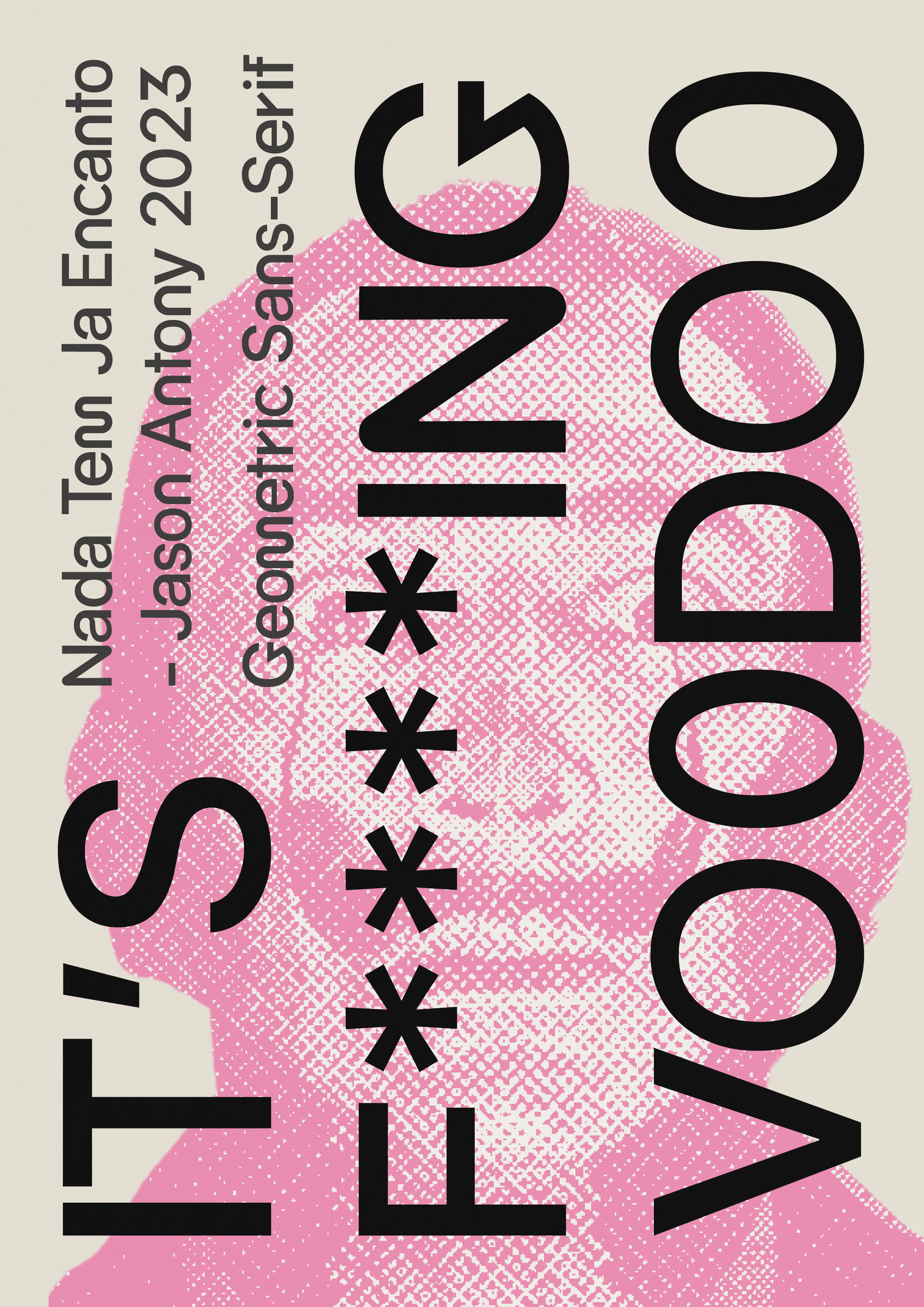
Fig.6.0 Final Type Specimen pg1 JPEG (06/07/2023)


3. Applications


FEEDBACK
Week 10 Specific Feedback: good development, however, the font is not remarkable. It needs to have minute details and design choices that make the font unique. The R does not fit.
Week 11 Specific Feedback: f is interesting. m and w are also interesting, however, the contrast between the letterforms could create an exciting feel or it might not. experiment on the curviness or rigidness of the letterforms, and research on the frequencies of letters in the English language.
Week 12 General Feedback: start putting in FontLab and start kerning.
Week 13 No class
Week 14 Specific Feedback: Mr.Vinod looks forward to my application. The type specimen is also good. since the font is not kerned perfectly, Mr.Vinod advised me to not use a lot of body text in my type specimen.
REFLECTIONS
Experiences
I've had the chance to study different facets of design along the way, get suggestions from Mr. Vinod, and hone my abilities. I've been able to develop as a design student by being presented with fresh challenges and educational opportunities every week. I also discovered how crucial it is to pay attention to details, especially when it comes to the design and uniformity of letterforms. Being able to incorporate UX Design, which is essentially my area of specialty in my further studies, throughout the application step was my favorite aspect of this experience.
Observations
During the process, I observed the importance of making several design choices that would make my font unique. Mr. Vinod's feedback played a crucial role in guiding me toward making informed decisions. Evidently, he asked me to judge my design by my own design sense. I felt that he trusted me to make those choices by myself. In the end, I was happy with the results. I've come to understand how crucial it is to conduct in-depth research, develop creative concepts, and pay close attention to every little thing when developing effective design solutions.
Findings
The biggest finding that I found during this task was the difficulty of kerning. Kerning is such a tedious task to do and I underestimated it at first. even though I thought that my kerning was sufficient, Mr. Vinod had so many problems with it. This shows me that it takes months to achieve the professional standard.
FURTHER READINGS

Fig. 7.0 Typographic design: Form and communication (2015)
Reference:
Carter, R., Day, B., Meggs, P. B., Maxa, S., & Sanders, M.
(2015). Typographic design: Form and communication.
Hoboken, New Jersey: John Wiley & Sons, Inc.

The Letter
-The fundamental nature of each letter is discussed in the first section on typographic syntax. This expertly crafted form, displaying subtlety and accuracy, serves as the defining characteristic between two families of kinds. There are several weights, sizes, and shapes available. (Fig. 7.1)
Even though a letter usually forms part of a word, it is common for different combinations of letters to be created. Figure 7.2 illustrates how the letters A and g are combined to form a stable gestalt. The individual letters in the samples with illustrations are expressive and bold. This syntax was taken from a wider system of signs and is an illustration of letter combinations working as signs.

Chapter 5: Syntax & Communication, Page 86 (06/07/2023)

Comments
Post a Comment