TYPOGRAPHY / TASK 2: TYPOGRAPHIC EXPLORATION AND COMMUNICATION
TYPOGRAPHY / TASK 2: TYPOGRAPHIC EXPLORATION AND COMMUNICATION
26/08/2022–16/10/2022 / Week 5–Week 7
Jason Antony / 0356335
Typography / Bachelor of Design (Hons) in Creative Media / The Design School
Task 2: Typographic Exploration and Communication
Lectures
See lecture notes in Task 1: Exercises.
Instructions
Module Information Booklet
Task 2 Typographic Exploration and Communication
References

Fig.0.1 https://pin.it/6BwXKXJ

Fig.0.2 https://pin.it/5dokYQ1
Sketches

Fig. 1.1 1st sketch (3/10/2022)

Fig. 1.2 2nd sketch (3/10/2022)

Fig. 1.3 3rd sketch (3/10/2022)

Fig. 1.4 4th sketch (3/10/2022)
Type Expressions
%20%5BRecovered%5D.jpg)
Fig. 2.1 (4/10/2022)
Layout Exploration
1st Exploration
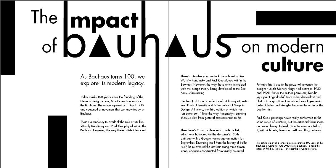

Fig. 3.1 Layout 1 (7/10/2022)


Fig. 3.2 Layout 2 (7/10/2022)


Fig. 3.3 Layout 3 (7/10/2022)
2nd Exploration
Out of the 3 layouts, I decided to iterate more on the first layout since I
felt like it has the most potential to produce the most interesting
layout.


Fig 4.1 Layout 1 iteration 1 (8/10/2022)


Fig 4.2 Layout 1 iteration 2 (8/10/2022)

Fig 4.3 Layout 1 iteration 3 (8/10/2022)

Shortlisted Layouts

Fig 5.1 shortlisted layout 1 (8/10/2022)

Fig. 5.2 shortlisted layout 2 (8/10/2022)
This is my 2nd favorite layout. I feel that this layout is united well and
easily readable, however, it lacks that wow factor.
Final Task 2: Typographic Exploration and Communication
Final Task 2: Typographic Exploration and Communication

Fig.6.1 Final Task 2 without grids (JPG) (14/10/2022)

Fig.6.2 Final Task 2 with grids (JPG) (14/10/2022)
Fig.6.3 Final Task 2 (PDF) (14/10/2022)
Small headings
Fonts: Futura Std (Book and Bold)
Point size: 27 pt
Sub-heading
Fonts: Futura Std (Book)
Point size: 14 pt
Body Text
Fonts: Futura Std (Book)
Point size: 10 pt
Leading: 12 pt
Paragraph spacing: 12
Line length: 45-55
Feedback
Week 6:
General feedback: always remember to make the layout easy for readers to
read
Specific feedback: Most of my friends liked my 1st design. I need to
digitize it asap. Also, make the contents of the text easily readable
and maintain a good reading hierarchy.
Week 7:
Specific feedback: the first shortlisted layout can be used. Mr.Vinod
suggested rotating the text even more.
Reflection
Experience
For me, completing this project was a fruitful learning experience since I learned more about the elements of layout design, basic layout design criteria, organizing content, and formatting text. There were so many things to verify and tweak to make sure it complied with typographic rules, like line length, that I found it difficult to come up with alternate layouts. I found it challenging because I wasn't happy with the bulk of my layout ideas. It was overall a tedious and meticulous process of selecting and experimenting with a plethora of layouts and designs.
Observations
In order to give text and layouts a sense of solidity and structure, I've noticed how each element must line up with something. This is particularly important when creating layouts that highlight the hierarchy of information. The use of guides and grids is crucial for the orderliness of the text in the layout which ultimately contributes to the overall design, hierarchy, and reading experience.
Findings
First and foremost, I discovered that it's not at all simple to create layout designs. I also discovered that trying new things is essential to writing an editorial that is both appealing and readable. I've learned during this task that amazing designs don't appear overnight. It needs careful consideration, plenty of editing, and fine-tuning.
Further Reading

Fig.7.1 Typographic design: Form and communication (2015)
I chose the book "Typographic design: Form and communication" for my further reading material.
Reference:
Carter, R., Day, B., Meggs, P. B., Maxa, S., & Sanders, M.
(2015). Typographic design: Form and communication.
Hoboken, New Jersey: John Wiley & Sons, Inc

Fig.7.2 Visual Hierarchy
In the Chapter entitled "Syntax and communication", The author explained Visual hierarchy. In this particular excerpt of the book (page 101), The author demonstrates various different types of layouts and their descriptions.
This is interesting to me as we have just learned how to design layouts. I am particularly interested in how the author explains the different types of layouts shown on the page. Specifically, through their explanations of "layout 5-44" I can relate my Task 2 layout to the highlighted layout and understand why a diagonal heading increases prominence within a given space.


Comments
Post a Comment