29/08/2022 - 29/09/2022
Jason Antony / 0356335
Typography /
Bachelor of Design (Hons) in Creative Media / Taylors university
Task
1: Exercise 1 & 2
LECTURES
Lecture 1: Development
1. Early Letterform Development: Phoenician to Roman
-
Writing was initially the scratching of sharpened sticks into wet clay or
stones that were carved with chisels.
-
Letterforms were largely derived from the tools and the medium of writing
that were used to write.
Fig. 1.1 Evolution from Phoenician Letter
-
Writing direction -
-
Phoenicians: Right to left.
-
The Greeks: 'Boustrophedon’ (how the ox plows), read alternately
from right to left and left to right. The same goes for the
direction of the letterforms.
-
Like the Phoenicians, the Greeks did not use neither punctuation or
letter spaces.
Fig. 1.2 Direction of Writing
2. Hand script from 3rd-10th century C.E.
Fig. 1.3 4th or 5th century Square Capitals
Square Capitals:
Written handwriting founded in Roman monuments. These letterforms have
serifs added to the finish of the main strokes. achieved using a reed pen
held at an angle of approximately 60° concerning the perpendicular.
Fig. 1.4 Late 3rd to mid 4th century Rustic capitals
Rustic Capitals:
The compressed version of square capitals allowed for twice the number of
words on a piece of parchment and took significantly less time to write.
They were faster and easier to do, but slightly more difficult to read due
to their compressed appearance.
Fig. 1.5 4th century Roman cursive
Roman Cursive:
Forms were simplified for speed because they were written for everyday
transactions. Lowercase letterforms originated from Roman cursive.
Fig. 1.6 4th to 5th century Uncials
Uncials:
Some characteristics of the Roman cursive hand were incorporated. Uncials
are short letters. At small sizes, broad forms of uncials are more
readable than rustic caps.
Fig. 1.7 C. 500 Half uncials
Half uncials:
2000 years after the foundation of the Phoenician alphabet, mark the
formal beginning of lowercase letterforms, complete with ascenders and
descenders.
Fig. 1.8 C. 925 Caloline minuscule
Caloline minuscule:
In 789, Charlemagne, Europe's first unifier since the Romans, issued an
edict standardizing all church writings. He delegated this responsibility
to Alcuin of York, Abbot of St Martin of Tours. The monks rewrote the
letters in majuscules (uppercase), minuscules, capitalization, and
punctuation, establishing the norm for calligraphy for a century.
Fig. 1.9 C. 1300 Blackletter (Textura)
Blackletter:
As Charlemagne's empire crumbled, regional variations of Alcuin's writing
emerged. A condensed, sharply vertical letterform known as Blackletter or
textura acquired popularity in Northern Europe. In the south, a rounder,
more open hand known as 'rotunda' became popular. In Italy, the humanistic
script is based on Alcuin's minuscule.
Fig. 1.10 C. 1455 42-line bible, Johann Gutenberg, Mainz
Gutenberg's type:
Engineering, metalsmithing, and chemistry were among Gutenberg's talents.
He marshaled them all to create pages that closely resembled the work of
the scribe's hand - Northern European Blackletter. Each letterform
required a different brass matrix, or negative impression, in his type
mold.
3. Text type classifications

|
Fig. 1.12 Oldstyle
|

|
|
Fig. 1.13 Italic
|

|
Fig. 1.14 Script
|

|
Fig. 1.15 Transitional
|

|
|
Fig. 1.16 Modern
|

|
|
Fig. 1.17 Square Serif / Slab Serif
|

|
Fig. 1.18 Serif / Sans Serif
|
Lecture 2: Text
1. Kerning and Letterspacing
Fig. 2.1 Kerning and letterspacing
Kerning: Automatic letter spacing adjustment.
Tracking: The process of adding and removing space from a word or
sentence.
Letterspacing: Adding space between letters.
Fig. 2.2 Normal tracking, loose tracking, and tight tracking
2. Text Formatting
Flush left: It closely resembles the asymmetrical experience of
handwriting. Each line begins at the same point but ends where the last
word on the line ends. Spaces between words are consistent throughout the
text, allowing the type to create an even grey value.
Centered: Gives both ends of a line equal value and weight and symmetry.
It converts text fields into shapes, giving them a pictorial quality.
Because centered type creates such a strong shape on the page, line breaks
must be adjusted so that the text does not appear jagged.
Flush right: Emphasizes the end of a line rather than the beginning.
It can be useful in situations where the relationship between text and
image is ambiguous (such as captions) and there is no strong orientation
to the right.
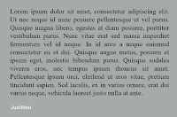
Justified: Imposes a symmetrical shape on the text by expanding or
contracting the spaces between words and, in some cases, between letters.
The resulting openness of lines can result in 'rivers' of white space
running vertically through the text on occasion. To correct this issue,
careful attention to line breaks and hyphens is needed.
3. Texture
Fig. 2.7 Anatomy of a typeface
Fig. 2.8 Different typefaces, different gray values
4. Leading and Line Length
Type size: The text type should be large enough to be read easily at arm's
length.
Fig. 2.9 Leading and line length
Leading: Text that is set too tightly encourages vertical eye
movement, making it easy for a reader to lose track. When the type is set
too loosely, it creates striped patterns that are distracting.
Line Length: Shorter lines require less leading, while longer lines
require more. It is recommended to maintain a line length of 55-65
characters. Line lengths that are too long or too short make reading
difficult.
5. Type Specimen Book
A type specimen book shows samples of typefaces in various different
sizes. It provides an accurate reference for type, type size, type
leading, type line length, etc.
Fig. 2.10 Sample Type Specimen Sheet
Lecture 3: Indicating Paragraphs
There are several ways to mark paragraphs. In the first figure,
"Pilcrow" is a medieval manuscript vestige that is no longer regularly
used.
-
Line spacing and paragraph space should be the same to ensure
that text columns are aligned (for example 11pt).
-
Here are a few instances of extended paragraphs with abnormally
broad text columns. Nonetheless, it may have compelling
compositional or practical factors in its favor.
-
In conventional typesetting, there are widows and orphans.
Designers must use extreme attention to avoid the aforementioned
situation.
-
Both widows and orphans are considered serious mistakes in the
justified text. Widows benefit from text with a ragged left and
flush right margins. Orphans are still illegal.
-
The only way to eliminate widows is to re-break all of your lines
ends such that the last line of no paragraph is noticeably
shorter.
-
Typographers go to considerable lengths to guarantee that no text
column begins with the final line of the preceding
paragraph.
-
It is the obligation of the typographer to ensure that these
headings convey to the reader in such a way that it is evident how
important each heading is in relation to the others in the
text.
-
A hierarchy exists when a list of subheads is established.
Lecture 4: Describing Letterforms
Typography: Basic
1. Describing letterforms
2. Font
-
Uppercase and lowercase
-
Small capitals
-
Uppercase and lowercase numerals
- Italic
-
Punctuation and miscellaneous characters
- Ornaments
Small Capitals
Uppercase letterforms are drawn to the typeface's x-height. Small
Caps are most commonly encountered in serif typefaces as part of the
so-called expert set.
Uppercase Numerals/Lining Figures
Uppercase letters are the same height as lowercase characters and
have the same kerning width. They are most commonly used with tabular
data and capital letters.
Lowercase numerals/old-style figures or text figures
With ascenders and descenders, set to x-height. When employing upper
and lowercase letterforms, this is the best option.
Italic
Italics allude to Italian cursive handwriting from the 15th century.
Oblique is often based on the typeface's roman form.
Punctuation, miscellaneous characters
Characters can switch from one typeface to another. Before selecting
a typeface, make sure that all of the characters are available in that
typeface.
Ornaments
In invites or certificates, they are used as flourishes. They are
often given as a font inside a bigger typeface family. Only a few
historic or classical types have decorative fonts as part of the
typeface family as a whole (Adobe Caslon Pro).
3. Describing typefaces
Roman: Uppercase forms are derived from inscriptions of Roman
monuments. 'Book' is a significantly lighter stroke in roman.
Italic: Named from the 15th-century Italian handwriting that
inspired the shapes. Oblique, on the other hand, is based on the
roman form of typography.
Boldface is distinguished by a thicker stroke than a roman form. It
is also known as 'semibold', 'medium', 'black', 'extra bold', or
'super'.
Light: A stroke that is lighter than the roman form. 'Thin' strokes
are much lighter.
Condensed: A variation of the roman form, and very condensed styles
are sometimes referred to as 'compressed.'
Extended: A roman typeface at a larger size.
4. Comparing Typefaces
There are differences in x-height, line weight, shapes, stroke
widths, and sensation. Feelings imply a certain application and
expression. Examining fonts enables us to understand how we feel about
specific kinds and to assess the appropriateness of type
choices.
Lecture 5: Understanding Letterforms
Some capital letter forms look to be symmetrical but are not. The
Baskerville stroke form contains two unique stroke weights, but what
stands out the most is the character arc that connects the serif to
the stem in each bracket.
Although the capital letter forms appear to be symmetrical at first
glance, a closer inspection reveals that the left slope is smaller
than the right. Baskerville and Univers show how much attention is
taken by a type designer to develop letterforms that are both
internally consistent and individually expressive.
Fig.5.1 Helvetica vs Univers
Examining the lowercase "a" of two seemingly identical sans-serif
typefaces reveals the complexity of each letterform. The obvious
difference in character between the two may be noticed by observing
how the stems and bowls of the letterforms fit together.
Recognizing accurate letterforms is crucial, but so is becoming aware
of the counter form that the form's strokes reflect. When letters are
combined to create words, the spaces between them become part of the
word's counter form.
This is especially true when working with letterforms that lack
counters, such as the lowercase 'r.' How you control counters during
typesetting influences how smoothly your sentences flow.
Lecture 6: Typography in Different Medium
Typography was thought to be dead until it was printed on paper. After
then, nothing changed. Skilled typesetters and designers produced an
intelligible typeface. Typography is currently available on a multitude of
devices other than paper. The operating system, system typefaces, the
device and screen itself, the viewport, and other variables all have an
impact on it. Because typesetting is now done in the browser, the
presentation of the website affects how we perceive typography.
Type for Print
Type was created to be read from print long before humans could read
from screens. It is the designer's responsibility to ensure that the
language is easy to read, fluid, and smooth.
Type for Screen
Type was created to be read from print long before humans could read
from screens. It is the designer's responsibility to ensure that the
language is easy to read, fluid, and smooth.
A fantastic typeface for printing: Caslon, Garamond, and Baskerville
are the most often used printing typefaces. They have the unique ability
to be sophisticated and intellectual while staying easily accessible at
modest letter sizes.
Hyperlink / Hyperactive Link
A hyperlinked word, phrase, or image allows you to jump to another
document or part within the one you're reading. By default, text
hyperlinks are blue and underlined. When you move your cursor over the
arrow, it should transform into a little hand pointing to the link,
whether it be text or an image.
Screen Font Size
To accommodate for reading distance, 16-pixel text on a screen is
almost the same size as text printed in a book or magazine.
Fonts for the Screen / Web Safe Fonts
Each device comes with its own set of fonts pre-installed. whose
operating system has a significant impact Each one differs somewhat,
which is a concern.
There may only be one set of Windows-based devices. macOS versions are
inspired by one another. The Android operating system then employs its
own.
Motion Typography
Typographers can "dramatize" type by using temporal media, making
letterforms "fluid" and "dynamic." The typographic information in a
film's title credits is presented gradually; animation is usually used
to bring it to life. Animated type is becoming more popular in motion
graphics, notably in film and television production company
branding.
Type is also regularly superimposed on ads and music videos, and it
frequently moves to the beat of the music. On-screen typography has grown
to become more expressive to reflect a set of corporate values or define
the tone of connected information. To prepare the spectator for the film,
the typography used in title sequences must generate a specific
mood.
Physical Class
Week 1 (29th August)
After introducing himself, Mr.Vinod lectured us about the program and
what typography is. He then went through the MIB, assignments, and TGCs
with us. For our first assignment, we were asked to come up with some
words on the spot and then vote on six of them, which are mentioned
below.
1. Freeze
2. Tired
3. Pain
4. Screech
5. Sticky
6. Slam
Besides that, we will be given 10 typefaces to work with for the next
stage which is digitalization. Before ending the class, we had a session
where we introduced ourselves.
Week 02 (5th Sep)
We showed Mr.Vinod our sketches for the assignment we were assigned
last week, and after Mr.Vinod gave us feedback on our work, we were
directed to digitize them using illustrator.
Week 03 (12th Sep):
As is customary, we presented Mr.Vinod our work one by one and
solicited his input. We must create a short and easy gif animation based
on our grasp of the principles of animation in AI and PS in class.
Week 04 (19th Sep):
As Mr.Vinod asked, we posted our animation on Facebook. After he
evaluated our efforts one by one before entering Adobe In Design, we
were given time to develop our animation based on his advice.
Week 05 (26th Sep):
INSTRUCTIONS
<iframe
src="https://drive.google.com/file/d/1DPvvNHx-istsDTgssJbRlN9re9rR0EDX/preview"
width="640" height="480" allow="autoplay"></iframe>
Task 1: Exercises - Type Expression
Type Expression: You will be given 4 words to compose and express.
Begin by sketching out ideas. Once the ideas are selected, you will be
given a set of 10 typefaces to work within
the digitization phase. Through iteration, use the appropriate
typeface and compose the letters in a manner that allows the meaning
of the word to become visible — still and in motion. (2 weeks).
Software: Adobe Illustrator and Adobe Photoshop.
Sketches
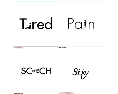
Fig.6.1 Type Expression Sketch "Tired" Week 2 (05/09/22)
Fig.6.2 Type Expression Sketch "Pain" Week 2 (05/09/22)
Fig.6.3 Type Expression Sketch "Sticky" Week 2 (05/09/22)
Fig.6.4 Type Expression Sketch "Screech" Week 2 (05/09/22)
Words chosen:
- Tired
- Pain
- Sticky
- Screech
Rough sketches were drawn in Procreate.
For the sketches, I went with Sticky, Screech, Tired, and Pain. For
Screech and Tired, Mr. Vinod said the sketches were good and they were ready to be digitized. For Sticky, Mr. Vinod particularly liked the sketch where all the letters were connected. He said I needed to finesse the word on illustrator to bring this sketch into its digitized form. And finally, for Pain, Mr. Vinod did not get the first sketch and he suggested further exploration. However, he was interested in how I can bring the second sketch into its digitized form without using too much distortion.
Digitization
|
|
Fig.7.1 First attempt of digitization (12/09/22)
|
I had changed the Pain from my sketch to the version in Fig. in the
digitization phase. The rest were digitized following the sketches made
previously.
And for the first attempt, Mr. Vinod Critiqued my work. He said that
Pain was too illustrative, so he asked me to simplify the "i" in the
word. For Tired He asked to not round the
corners of the "i". For Sticky, he asked to simplify the letter "y" by removing the
continuation of the letter "y". Lastly, for screech, He said that the word is too small compared to the frame.
Fig.7.2 Second and reworked designs (19/09/22)
Final
Fig.7.3 Final Type Expression - JPEG (19/09/2022)
Type Expression Animation
Fig.7.4 Type animation frames in AI (19/09/2022)
Fig.7.5 First Type animation frames in Photoshop (19/09/2022)
As shown in Fig. I created 25 frames because I wanted them to be as
smooth as possible, but after importing all of the frames into
Photoshop, I discovered that I had been too focused on the smoothness
and had forgotten that the movement speed of animation also provides
effects. This resulted in the animation shown in Fig.7.8
Fig.7.6 first Type animation (19/09/2022)
Fig.7.7 Second Type animation frames in Photoshop
(19/09/2022)

Fig.7.8 Second Type animation (19/09/2022)
I also included the Version of the animation using more frames. It is
shown in Fig. . I personally like the shorter animation because it feels
more fluid.
Final
Fig.7.9 Final Animated Type Expression "Tired" - GIF
(19/09/2022)
In my final design, I ended up going with the longer version of the
animation because Mr. Vinod preferred that one.
Because I had the clearest image for the phrase "Tired," I gave this
animation my best, aiming to convey the feeling I intended. Although the
final product wasn't as perfect as I had hoped for, I am nevertheless
pleased to have accomplished this in such a short amount of time.
Task 2: Exercises - Text Formatting
Formatting Text: Before commencing watch lectures: Text: P1 and Text:
P2. You will be given incremental amounts of text that address
different areas within text formatting i.e. type choice, type size,
leading, line-length, paragraph spacing, forced-line-break, alignment,
kerning, widows and orphans, and cross-alignment. These minor
exercises (Formatting Text 1:4 to 4:4A) will increase your familiarity
and capability with the appropriate software and develop your
knowledge of
information hierarchy and spatial arrangement. The task ends with the
submission of one layout in A4 size demonstrating what you have
learned from the incremental exercises. (2 weeks).
Software: Adobe InDesign
Kerning Exercise
Fig.8.1 Without Kerning (26/09/2022)
Fig.8.2 With Kerning (26/09/2022)
This was the activity we needed to do after watching those pre-recorded
YouTube videos that let us practice and become acquainted with
kerning.
Exercise 2 - Text Formatting
Fig.8.3 Text Formatting With Grid JPEG (26/09/2022)
Fig.8.4 Text Formatting Without Grid JPEG (26/09/2022)
Mr. Vinod said that the text is over kerned and advised me to re-kern
the text. He also asked me to change the picture to something more
related.
Final Text Formatting
Fig.8.5 Final Text Formatting With Grid JPEG (02/10/2022)
Fig.8.6 Final Text Formatting JPEG (02/10/2022)
Fig.8.7 Final Text Formatting PDF (02/10/2022)
BODY
Font/s: Univers LT Std
Type Size/s: 8pt
Leading: 10pt
Paragraph spacing: 10pt
Characters per-line: 35-45
Alignment: Left Align
Margins: Top and Bottom 30mm, Left and Right 20mm
Columns: 3
Gutter: 5mm
HEADING
Font/s: ITC Garamond Std
Type Size/s: Heading 48pt Subheading 12pt
FEEDBACK
Week 2
Specific Feedback
Screech - Mr. Vinod said the sketches were good and they were ready to be digitized.
Sticky - Mr. Vinod particularly liked the sketch where all the letters were connected. He said I needed to finesse the word on illustrator to bring this sketch into its digitized form.
Tired - Mr. Vinod said the sketches were good and they were ready to be digitized.
Pain - Mr. Vinod did not get the first sketch and he suggested further exploration. However, he was interested in how I can bring the second sketch into its digitized form without using too much distortion.
General Feedback
It is best not to incorporate too much imagery or other elements
aside from the words themselves.
Week 3
Specific Feedback
Pain - too illustrative, simplify the "i"
Tired - don't round the corners of the "i"
Sticky - don't do unnecessary continuations for the letter "y"
Screech - the word is too small compared to the frame
General Feedback
To be clear, distorting the words is not a solution.
Week 4
Specific Feedback
Final Type expressions were good to go. Tired animation works fine. The first animation was too crude. The second animation (more frames) works fine.
General Feedback
We should all prepare our blogs and watch pre-recorded videos on
YouTube.
Week 5
Specific Feedback
The Text is over kerned and it causes inconsistency in the spacing between words. this causes rivers and causes the whole text to have an uneven gray.
General Feedback
No colored pictures are allowed.
It is crucial to accurately align photos and make sure they are aligned to another design element.
The need for cross-alignment exists.
It is unnecessary and difficult to read to bold or italicize the whole body of text.
Use an image that is relevant to the topic instead if at all possible.
Condensed fonts shouldn't be used for the main body. They are only suitable for brief passages of text and are infamous for being hard to read.
Use proper leading at all times; it should not be more than three points bigger than the font size.
Bodoni features extremely thin and thick strokes, making it a high-contrast typeface. Because at a small point size, it is not suitable for body text.
REFLECTION
Experience
Through this job, I became familiar with the foundations of
typography. It was challenging for me to come up with thoughts because
we were only allowed to utilize ten typefaces throughout the designing
process and were not allowed to use visuals or abstract typography. We
were all given those six words, so I knew that many of my ideas would
be somewhat similar to those of my classmates, which made it more
difficult to come up with creative ideas. Because I am entirely
unfamiliar with Adobe Illustrator, it took me some time during the
digitization stage to get used to it. The text formatting practice was
also quite challenging; for me, the kerning and tracking are the most
challenging aspects.
Observations
Throughout this exercise, I've seen that several design components
work hand in hand with typography, like alignment in establishing a
feeling of hierarchy and visual weight and letters taking on various
forms or graphics.. I also learned that the choices of fonts are
extremely important for designing, and they shouldn't be
overlooked.
Findings
I've found that there are many laws governing typography, all of
which I had to absorb, understand, and remember. I learned that we
must train ourselves to pay great attention to even the slightest
elements if we want to improve our typography. I've also learned that
there are lots of factors to take into account while designing and
organizing type.
FURTHER READING

Fig.9.1 Typographic design: Form and communication (2015)
I chose the book "Typographic design: Form and communication" for my further reading
material.
Reference:
Carter, R., Day, B., Meggs, P. B., Maxa, S., & Sanders,
M.
(2015). Typographic design: Form and communication.
Hoboken, New Jersey: John Wiley & Sons, Inc.
Fig.9.2 Letterforms analyzed
In the Chapter entitled "The Anatomy of Typography", The author explained
the parts of letterforms. This part is similar to the explanation that has
been taught in Mr. Vinod's Lecture about understanding letterforms. What
piqued my interest from this particular section in the book was how the
letter forms were proportioned. 4 major variables determine how letters
are proportioned.
-
Stroke-to-height ratio
-
Contrast in stroke weight
-
Expanded and condensed styles
-
X-height and proportion
Fig.9.3 Proportions of letterforms
Personally, the most interesting variable for me was the findings of
Contrast in stroke weight. The thick/thin contrast creates variation in gray values. The
stronger the contrast, sometimes it will become harder to read, the
examples shown in the lecture videos. For example, "1757 Baskerville"
shows significant contrast between the strokes in the letter "O". The
top and bottom parts of o are much thinner than the left and right
sides. Conversely, "1816 First sans serif" shows no contrast in the
letter "O". the stress completely disappeared and it showed no
contrast between the Top, bottom, left, and right sides of the
letterform.


.jpg)


Comments
Post a Comment