Design Principles - Exercises
29/08/2022 - 23/09/2022 (week 1- week 4)
Jason Antony / 0356335
Design Principles / Bachelor of Design (Hons) in Creative Media / Taylors university
Task 1: Exercises
LECTURES
Lecture 1:
Dr. Jinchi's lecture covered all design aspects and concepts, as well as gestalt theory and contrast. These ideas we taught are critical and serve as the foundation for us designers. These concepts are essential in our work, and we must learn how to analyze and apply them in order to produce great designs.
Gestalt Theory
The whole is different from the sum of its parts. Gestalt theory is to organize visual elements into groups or 'unified wholes' when certain principles are applied. The mind will attempt to fill in details that aren't actually there.

- Principle of Similarity
- Even if similar parts in a design are separated, the human eye perceives them as a full picture, shape, or group. The brain appears to connect items of related nature.
- Principle of Continuation
- The human eye follows a design's paths, lines, and curves and tends to see a continuous flow of visual elements rather than separated objects.
- Principle of Closure
- Complete shapes are preferred by the human eye. If the visual elements are lacking, the user can perceive a complete shape by filling in the gaps.
- Principle of Proximity
- Ensures that relevant design elements are positioned together. Unrelated objects should be separated. Close proximity suggests that elements are linked or have a relationship to one another and form a single visual unit that helps to organize or structure a layout.
- Principle of Figure/Ground
- Objects are instinctively judged to be in the foreground or background. They either stand out in the front (as in the figure) or recede into the back (the ground).
- Law of symmetry and order
- According to this law, components that are symmetrical to each other are viewed as a coherent group. This rule, like the law of similarity, says that items that are symmetrical with each other are more likely to be classified together than those that are not symmetrical with each other.


Photography


Lecture 2:
Balance
The distribution of visual weight in a design work is referred to as balance. The visual balance of the elements is what makes the whole image look balanced. There are 2 types of balance in design, Asymmetrical or symmetrical balance.
Symmetrical Balance
- Has equal "weight" on both sides of a centrally located fulcrum.
- Bilateral balance is achieved when equal arrangement of elements are present on either side of the central axis.
- Radial balance is achieved by arranging pieces evenly around a focal point.
- When analogous but not identical shapes are grouped around the fulcrum line, this is referred to as approximate symmetry.

- Each side of the composition has an unequal visual weight.
- A prominent element on one side of the composition may be balanced by a couple or more minor focus points on the opposite side.
- More dynamic and fascinating. It inspires thoughts of modernity, movement, energy, and life.
- Asymmetrical balancing provides greater visual variation, but it can be more difficult to produce due to the more intricate interactions between pieces.

-
Also known as phi, the Golden Ratio (other names: Golden Mean, Golden Section) is amathematical concept and a number that goes on indefinitely (1.618033988749895…). The ratioitself comes from the Fibonacci sequence, a naturally occurring sequence of numbers that can befound everywhere, from the number of leaves on a tree to the shape of a seashell.
- Many people have regarded the Golden Ratio as a symbol of ideal beauty or as being found only in nature over the centuries.
- For centuries, the Golden Ratio has been utilized as a guide to establish visual harmony in architecture and art.
- The Golden Ratio may be utilized by designers, illustrators, and digital artists to provide harmony, balance, and structure to their work. It can also improve the visual attractiveness of a design effort.

- It is a composition guideline used to provide energy to a design/photography/film/painting production.
- An image is divided into thirds, both horizontally and vertically, and the focus is positioned at the junction of those dividing lines, or along one of them.


Lecture 3:
Repetition
Repetition may make a design appear lively. The recurrence of design components provides rhythm and pattern in the work. Variety is necessary to keep rhythms fresh and lively while avoiding monotonous designs. Pattern adds visual appeal to the surface, increasing visual excitement.


Movement
The path that a design takes the eye in, around, and through a composition. Motion or movement in a visual picture happens when items appear to move in a visual image. Movement in a visual image is caused by the shapes, forms, lines, and curves that are employed.
Hierarchy
The choreography of content in a composition to transmit information and express meaning is known as hierarchy. Visual hierarchy leads readers to the most essential information first and distinguishes secondary content navigation.

Alignment
Alignment is the placing of pieces in such a manner that their edges line up along common rows or columns, or their bodies line up at a common center. Alignment produces a sense of unity and cohesiveness, which contributes to the overall aesthetic and perceived stability of the design. Alignment also is a powerful tool to guide the observer through a design.

Lecture 4:
Harmony
Harmony is achieved by selecting pieces that have a common quality. Without variation, harmony becomes monotonous. Harmony is the sense that all of your design's aspects fit together. They may have a same topic, artistic style, or mood.

Unity
The recurrence of specific aspects throughout your design whether colors, forms, or materials to tie the appearance together is referred to as unity. When these parts are combined in such a manner that they are balanced and offer a sense of oneness, a theme is formed. Although unity and harmony may sound identical, they play different roles in how we perceive design.

Scale and Proportion
Scale is the size and dimension of figures and shapes in relation to a given unit of measurement. There are two techniques to determine scale: Actual measurement and Visual estimation.
Architectural drawings and scale models are two examples of scale in action. Scale is also used to specify or depict features based on the relative sizes of items. Significant variation from a standard scale relationship can provide dramatic consequences and aesthetic appeal in the design or composition.
In art and design, proportion refers to the relationship of two or more parts in a composition and how they compare to one another in terms of size, color, number, degree, context, and so on; i.e. ratio. Proportion is considered to be harmonic when there is a proper relationship between the parts in terms of size or quantity. The successful use of proportion in design frequently results in harmony and unity.

Lecture 5:
Symbol
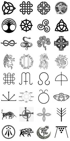
• A sign, shape, or object that is used to represent
something else (Cambridge Dictionary, 2020).
• In design, symbols can provide or convey information,
equivalent to one or more sentences of text, or even a
whole story (Eco, 1976 & Pettersson, 2015).
- Pictorial Symbols
- Image-related and simplified pictures.

- Abstract Symbols
- Abstract symbols might resemble the items they represent yet have less information.

- Arbitrary symbols
- Arbitrary symbols bear no similarity to the objects or concepts they represent.
- The sign is created, and the meaning is built.
- Many of them are built around geometric shapes and colors.
- Learning Arbitrary symbols is crucial.


INSTRUCTIONS
- Gestalt theory
- Contrast ✔
- Emphasis
- Balance ✔
- Repetition ✔
- Movement ✔
- Harmony& Unity ✔
- Symbol
- Word and Image
- a recap of the selected design principle
- your design process:
- visual references (designs that have inspired your own)
- idea exploration and description
- final design in JPEG and a short rationale
- the feedback that was given by the lecturer
- reflection on the particular week

I want to recreate a photograph of a woman into a digital painting with a similar technique as the paintings in my visual references. Like the painting that I referenced, I used the same idea for the background, which is using two halves of white and black. I used my style to portray the woman from my reference image in my painting. I also used a lot of lines to give extra depth to the contour and highlights of the face. The inverse of colors in the two halves gives a lot of contrast. To me, it conveys an unsettling yet satisfying atmosphere that I really like.

Final
.jpg)
Regarding my final result for Contrast, I drew it using the references mentioned above. In my painting, I applied my own style to depict the woman from my reference photograph. Personally, I'm delighted I took the time to reflect and come up with a unique contrasting design. To create a more contrasted effect, I maintained every component of the drawing in black and white. Overall, I believe my final design creates an unsettling yet gratifying vibe, which I enjoy.
Balance
The distribution of visual weight in a design work is referred to as balance. The visual balance of the elements is what makes the whole image look balanced. There are 2 types of balance in design, Asymmetrical or symmetrical balance.
Design Process
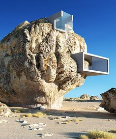
Visual references:


Sketches:


Harmony
Harmony is achieved by selecting pieces that have a common quality. Without variation, harmony becomes monotonous. Harmony is the sense that all of your design's aspects fit together. They may have a same topic, artistic style, or mood.
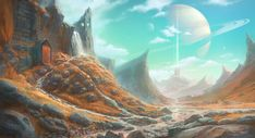
Design Process
Visual references:


Idea Exploration and description:
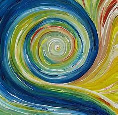
For this design principle, I wanted to express the harmony of colors. The color scheme I used for this composition is complementary colors. The yellow sand and the blue ocean are opposites in the color wheel, and they give a sense of harmony when used in the same composition. I also used different shades of blue to indicate the different depths of the water. This also creates harmony among the same color theme.
Sketches:
Final
.jpg)
I wanted to accentuate the beauty of the ocean in my final Harmony design. I believe I have successfully implemented this design idea by using complementary hues and preserving balance throughout the design.
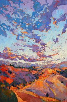
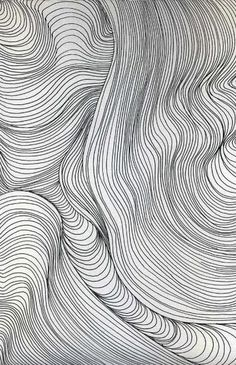
Movement
The path that a design takes the eye in, around, and through a composition. Motion or movement in a visual picture happens when items appear to move in a visual image. Movement in a visual image is caused by the shapes, forms, lines, and curves that are employed.
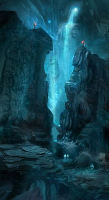
Design Process
Visual references:

Idea Exploration and description:
For this design principle, I wanted to express movement through lines. I feel that even though lines are simple, they can be combined and arranged in a way that expresses more complex shapes and ideas. that is what I did with this composition. I used lines of different length and stroke to create movement within the design.
Sketches:

Final
.jpg)
I intended to convey the flow of running water through arbitrary configurations of lines and curves in my Movement final design. I am pleased with this design since, in comparison to the earlier designs, I believe I have finally emphasized the dynamic component of water.
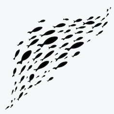
Repetition
Repetition may make a design appear lively. The recurrence of design components provides rhythm and pattern in the work. Variety is necessary to keep rhythms fresh and lively while avoiding monotonous designs. Pattern adds visual appeal to the surface, increasing visual excitement.
Design Process
Visual references:
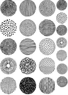

Idea Exploration and description:
For this design principle, I want to use the same shapes and lines to create a composition. the only change incorporated is the size of the circles and the direction of the lines within the circles. To me this composition emphasizes the use of repetition in a different and unorthodox way.
Sketches:


Comments
Post a Comment